
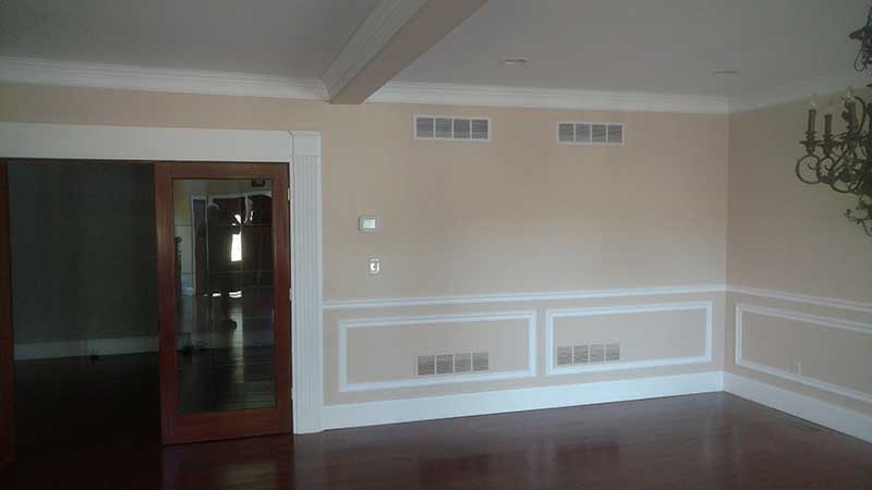
How interior paint colors affect mood, and how to pick the right one for each room
On this page · 8 sections
When we walk into a room to talk about a paint job, the first question usually isn't about brushes or rollers. It's "what color should we go with?" That's the right place to start. Paint is the biggest surface in most rooms, and the color on the walls changes how the space feels long before anyone notices the furniture, the floors, or the trim.
Color won't fix a cramped layout or a drafty window, but it does shift the mood. Some colors settle a room down, some wake it up, and some make people want to linger at the table a little longer. Here's how we think about it when we help homeowners plan an interior painting project, room by room.
The short answer
Bottom Line Up Front
Cool, light colors like soft blues, greens, and grays tend to calm a room and make it feel bigger. Warm, deeper colors like reds, terracottas, and golden yellows tend to energize a room and draw people together. Pick by what the room is for, then test the color in that room's light before you commit.
Color psychology isn't a rulebook, and the shade you love on a chip can look very different on four walls. But matching the mood of the color to the job of the room gets most homeowners close, and a few days with a large sample on the wall settles the rest.
The rest of this post walks through the main color families, how light changes them, and a decision table at the end that matches common rooms to the kind of color that tends to suit them.
Cool colors: blues, greens, and soft grays
Blues and greens are the colors most people describe as calm. They remind us of water and open sky, which is part of why they feel so natural in coastal Delaware homes. Light blues and sage greens tend to make walls feel like they're stepping back, so a small bedroom or a narrow hallway reads as more open. Soft grays do something similar, though a gray that leans too cool can feel flat or chilly in a room without much sun.
Cool colors are a good fit for bedrooms, bathrooms, and home offices, where the goal is to slow down or focus. Go deeper, into navy or forest green, and the same families become dramatic and cozy instead of airy. That can work beautifully on one accent wall or in a den, but it's a different mood than the pale version of the same color.
Warm colors: reds, oranges, yellows, and earth tones
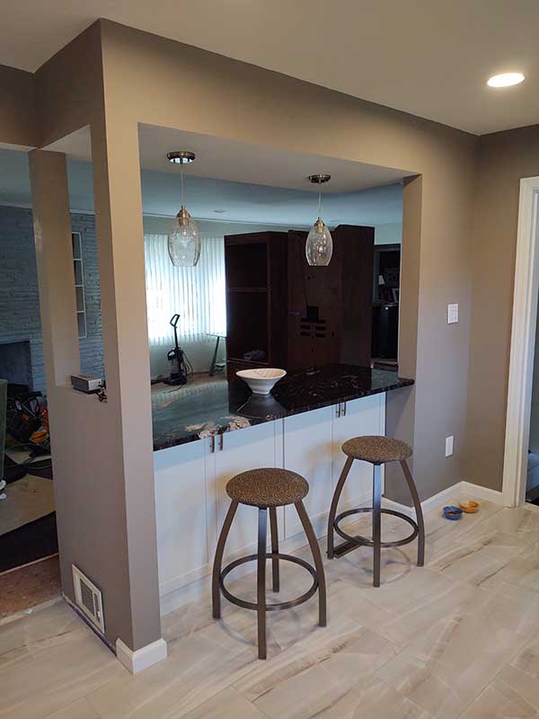
Warm colors pull a room toward you. Reds and terracottas feel energetic and social, which is why they show up so often in dining rooms. Oranges and peaches read as friendly and upbeat. Yellows feel cheerful in small doses, though a bright yellow on every wall can tip from sunny to tiring. Warm neutrals like beige, tan, and taupe carry a little of that welcome without the intensity.
Warm colors are a natural choice for kitchens, dining rooms, and entryways, the places where people gather or first walk in. They also help balance a room that faces north and never gets direct sun, since they keep the walls from looking gray and cold.
Color families at a glance
This is the quick version of the conversation we have when we come out to look at a room. Each row is a color family, how it tends to feel, and where we'd usually put it.
| Color family | How it tends to feel | Where we'd use it |
|---|---|---|
| Light blue | Calm, airy, restful | Bedrooms, bathrooms |
| Sage and soft green | Fresh, balanced, easy | Living rooms, kitchens, offices |
| Cool gray | Clean, modern, can feel chilly | Sunny rooms, offices |
| Warm gray and greige | Relaxed, versatile | Living rooms, open floor plans |
| Soft yellow | Cheerful, welcoming | Kitchens, breakfast nooks |
| Peach and terracotta | Warm, friendly, social | Dining rooms, entryways |
| Red | Energetic, bold | Dining rooms, accent walls |
| Navy and deep green | Cozy, dramatic | Dens, accent walls, built-ins |
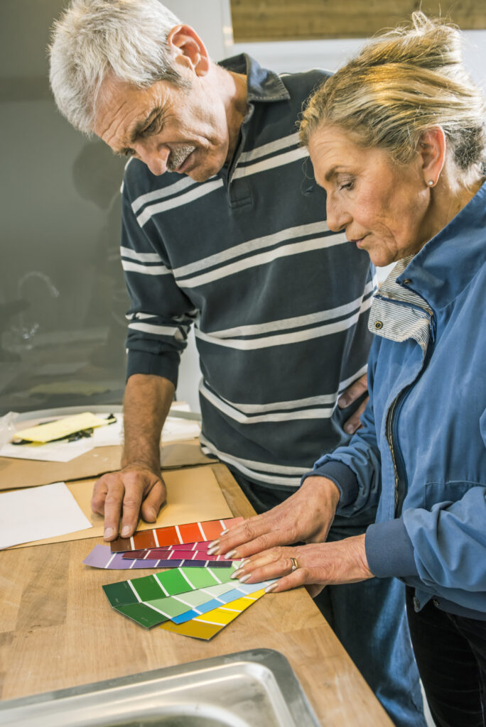
Put up a large sample on two or three different walls and look at it in the morning, in the afternoon, and at night with the lamps on. A color that looks perfect on a small chip can turn darker, grayer, or warmer once it covers a whole wall in your light. Living with a sample for a few days is the cheapest insurance against repainting.
Light changes everything
The same can of paint can look like two different colors in two rooms of the same house. North-facing rooms get cooler, softer light all day, so colors look a shade grayer and darker. South-facing rooms get warm, bright light that can make yellows and oranges feel louder than you expected. East and west rooms shift through the day, cool in one half and warm in the other.
Your bulbs matter too. Warm-white bulbs push walls toward yellow, and cooler bulbs push them toward blue. If you're planning to change your lighting, do that first, then pick the paint. For tight rooms, pairing a light wall color with good lighting is one of the simplest ways to make a small space feel bigger.
Walls never stand alone. A cool gray can look muddy next to warm oak floors, and a bright white wall can make yellowed trim look dingy. Hold your sample up against the floor, the cabinets, and the trim before you decide. If the trim itself is worn or dated, that's a good time to look at updating it along with the walls.
Choosing a mood for each room
Start with what happens in the room. A bedroom is for winding down, so soft blues, greens, and muted neutrals usually win. A kitchen and dining room are for cooking and gathering, so warm neutrals, soft yellows, or a deeper red can make the space feel lively. Living rooms are a balance, which is why warm grays and greiges are so popular there. Bathrooms often look crisp in pale blues and greens, and home offices tend to do well in calm, steady colors that don't pull your eye.
Signs a soft, light palette fits
The room needs to feel calmer or bigger than it does now.
What we look for
- The room is small, narrow, or has a low ceiling.
- There are only one or two windows, or they face north.
- The room is mostly used for sleeping, bathing, or quiet work.
- The floors, cabinets, or furniture already carry plenty of color.
Signs a warmer, deeper color fits
The room needs more energy, warmth, or personality.
What changes the answer
- The room is large and open and feels empty with pale walls.
- People gather here to eat, talk, or entertain guests.
- The room gets strong, steady daylight that can handle a deeper shade.
- White trim, wainscoting, or built-ins are there to frame a bolder wall.
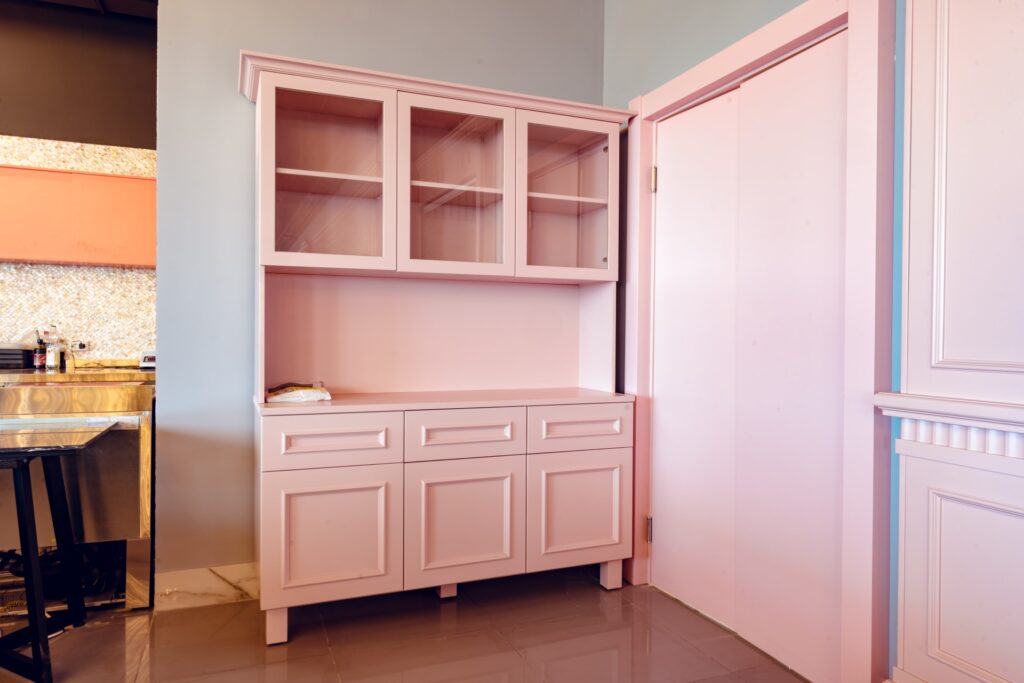
Bold color doesn't have to go on every wall. A painted accent wall, a set of built-ins, or a single piece of furniture can carry a strong color while the rest of the room stays quiet.
“We treat your home as though it were our own. If we wouldn’t be happy living with a color and a finish in our house, we won’t leave it that way in yours.”— AEB Services, Inc.
The decision table
If you only do one thing with this post, use this table. Find the rows that describe your room, then see which side has the stronger answer. Most rooms match more than one row, so go with whichever column wins the most of your rows.
| If the room… | Cool & light | Warm & deep |
|---|---|---|
| Is a bedroom where you want to wind down | Yes, calming | Muted shades only |
| Is small or short on windows | Yes, opens it up | Closes it in |
| Is a dining room for gathering | Can feel chilly | Yes, inviting |
| Faces north and never gets direct sun | Can read gray | Yes, adds warmth |
| Gets strong afternoon sun | Yes, balances it | Test it first |
| Is a home office where you need to focus | Yes, steady | As an accent |
| Is a large open room that feels empty | Feels emptier | Yes, cozier |
The bottom line
There's no single right color for a room, but there is usually a right direction. Decide what you want the room to feel like, choose a color family that matches, and then test the depth of that color in the room's own light. Cool and light for calm and space, warm and deeper for energy and gathering, and a neutral in between when the room has to do a little of both.
If you'd like a second set of eyes, that's what our walkthrough is for. We'll talk through what you want, come out to look at the space, and give you a quote, which is typically free. Homeowners from Millsboro to Angola by the Bay call us for exactly this, and you can see some of our finished rooms in our project gallery.